How to Style a Bookshelf: 7 Designer Tricks That Work in Any Home
How to Style a Bookshelf: 7 Designer Tricks That Work in Any Home
A bookshelf is the most personal piece of furniture you own — and the hardest to style. Here’s the system designers actually use.
Most bookshelves fall into one of two traps: the overstuffed wall of paperbacks that looks chaotic, or the deliberately curated shelf that looks like no one actually lives there. The goal is somewhere between — warm, personal, and visually intentional.
These 7 tricks are the same principles interior designers use on every project. You don’t need to buy anything new. Start with what you have.
The Core Rule: Vary Your Rhythm
Bookshelves look best when you alternate between vertical books, horizontal stacks, and objects. Never fill an entire shelf with spines facing forward — the eye has nowhere to rest.
The 7 Tricks
Edit Ruthlessly First
Before styling anything, remove 40% of what’s on the shelf. Overfilled shelves look cluttered regardless of how carefully you arrange things. Pull everything off. Only put back what you genuinely love or use.
Books you haven’t touched in 5 years? Donate them. Souvenirs that mean nothing now? Box them. The styling work happens in the empty space, not in the objects.
Use the Triangle Principle
Place your three tallest or most visually dominant objects in a triangle pattern across the shelf — not all clustered in one spot. This creates a natural visual flow and makes the eye move across the whole unit instead of getting stuck in one corner.
The triangle works at shelf level (one object left, one center, one right) and also across the full bookcase (top-left, middle-right, bottom-left).
Horizontal + Vertical Book Stacks
Never arrange all books vertically. Alternate vertical rows with horizontal stacks of 3–5 books. The horizontal stacks serve two purposes: they break up the visual monotony of spines, and they create a platform to place a small object on top — a candle, a small vase, a figurine.
For a cleaner look, turn some books around so the pages face out. This creates a neutral texture and makes the shelf look more designed, less like a used bookstore.
Layer Front to Back
Most people treat shelves as flat surfaces and line everything up along the back edge. Designers layer front to back instead. Put a larger item at the back, a smaller item in front of it, slightly off-center. This creates depth even on shallow shelves.
Example: a framed print leaning against the back wall, a small plant in front of it, a candle holder to the side. Three items, one shelf zone, visual depth achieved.
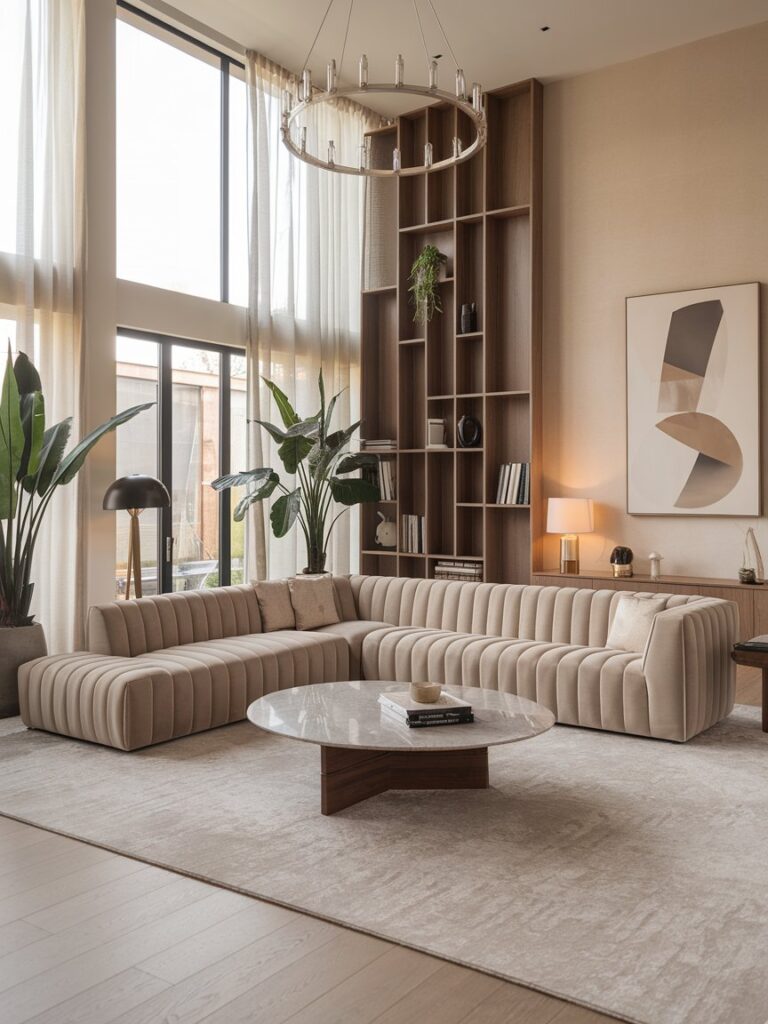
Add a Plant on Every Other Shelf
Plants are the fastest way to make a bookshelf look alive. But don’t put one on every shelf — it becomes predictable. Place trailing plants (pothos, string of pearls) where they can spill over the edge. Place upright plants (small snake plants, succulents) where you want a vertical element.
If you kill every plant you touch: high-quality artificial plants from Amazon or IKEA work just as well in photographs and at a glance. The texture is the point, not the photosynthesis.
Stick to a Tight Color Palette
This is the trick that separates random-looking shelves from styled ones. Choose 2–3 colors and repeat them across every shelf. Your colors might be: warm neutral (cream/tan), a muted green, and warm wood. Everything on the shelf should fall within or complement those three.
When you look at the bookshelf as a whole, those repeating colors create a visual rhythm that feels intentional. Random colors — even beautiful individual objects — create visual noise when grouped together.
Light It
A bookshelf without lighting is a missed opportunity. Small battery-powered LED puck lights tucked into the top corners of shelves cast a warm glow that makes the whole unit look like a piece of art. Clip-on reading lights work too, but the effect is more utilitarian.
Rope lights or LED strip lights tucked behind the back panel (on built-ins) create a floating backlit effect that looks genuinely high-end. This is the single upgrade that photographs the best and gets the most compliments in person.
What to Put on a Bookshelf (Beyond Books)
| Category | Good Examples | Quantity per Shelf |
|---|---|---|
| Plants | Pothos, succulents, faux stems | 1 per 2–3 shelves |
| Decorative objects | Vases, sculptures, ceramic bowls | 1–2 per shelf zone |
| Framed photos | Leaning (not hanging), personal or art prints | 1–2 max per shelf |
| Candles | Pillar or taper in neutral tones | 1 per shelf (top-only) |
| Baskets/boxes | Seagrass, rattan, lidded storage | 1–2 per lower shelf |
| Bookends | Marble, brass, concrete — avoid novelty | 1 pair per vertical book section |
| Art objects | Small figurines, stone pieces, unique finds | Sparingly — 1–2 total |
Top Product Picks for Shelf Styling
Mkono Ceramic Vase Set of 3
Three graduated heights in matte white and terracotta. Perfect for applying the triangle principle — the size variation does the compositional work for you. Flat-bottomed, won’t tip on shelves.
Pros
- 3 heights included
- Neutral palette
- Stable base
Cons
- Ceramic — can chip
- Not waterproof inside
Threshold Woven Seagrass Basket
Natural seagrass weave, handles included. Lower shelf staple for hiding remote controls, cables, or anything you don’t want visible. Collapses flat for storage when not in use.
Pros
- Hides clutter
- Natural texture
- Collapsible
Cons
- Handle adds height
- Not stackable
The Dos and Don’ts
Do This
- Edit to 60–70% full
- Mix book orientations
- Repeat your 2–3 colors
- Add at least one plant
- Layer front to back
- Light the shelves
- Use odd numbers of objects
Avoid This
- Packing shelves completely full
- All vertical books, all the way across
- Mixing too many color families
- Symmetrical mirror-image arrangements
- Novelty items and tchotchkes
- Lining everything up against the back wall
- Ignoring the shelf as a whole composition
Frequently Asked Questions
By color for purely decorative shelves; by subject if you actually use the books for reference. A color-organized shelf photographs beautifully but can be frustrating to navigate. A practical compromise: organize sections by subject, but within sections, loosely group by spine color. You’ll never get it perfectly organized so don’t stress the details.
KALLAX units have deep, square compartments — treat each square as its own mini composition. BILLY bookcases are more traditional. For both: use the layering trick (back to front), add baskets for lower squares on KALLAX, and avoid filling every single compartment. The emptier zones give the styled ones more visual prominence.
Photographs flatten depth and amplify visual clutter. For better shelf photos: reduce the number of items by another 20%, ensure objects are lit from the front or side (not just ambient ceiling light), shoot straight-on at shelf height rather than from above, and look for any objects that “pop” in color in ways that look jarring in the frame. Remove those for the photo.
Keep Reading
Best Decorative Items for Home: 10 Accents That Elevate Any Room → Small Living Room Ideas: 8 Space-Saving Tricks → Home Decor Trends 2026: What’s In, What’s Out →Style Your Shelf in an Afternoon
Edit to 60–70% full. Vary vertical and horizontal books. Use the triangle principle. Stick to 2–3 colors. Layer front to back. Add one plant. Light it. That’s the entire system — and it works on every bookshelf from a $30 KALLAX to a built-in library.